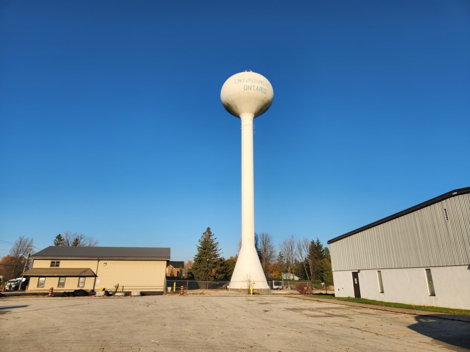
The water tower in Thornbury is going to stay white.
At its committee of the whole meeting on Nov. 29, The Blue Mountains council voted 6-0 (deputy mayor Peter Bordignon was absent) in favour of a plan to repaint the water tower the same colour it is currently.
The previous council had been given the option of choosing a new paint scheme for the water tower, but decided to punt the decision to the incoming council.
The water tower must undergo extensive rehabilitation work to extend its lifespan by 18-25 years. As part of the work, the tower will have to be repainted. Town staff presented council with a number of potential paint designs for the tower.
Solid colour designs (the lowest cost option between $300,000 and $315,000 not including text) suggested were white, green, or blue paint for the water tower. A colour block option was also suggested with blue or green for the top and bottom of the tower and a white band through the middle where the city names would be printed. Adding a colour block would bump the cost up to about $340,000.
Finally, and most costly, would be a detailed design to depict leaves, water, and rolling hills at about $370,000 to $400,000 plus the cost of adding text.
The future colour of the water tower generated plenty of interest in the community. Former councillor Bill Abbotts commented briefly at the meeting about his desire to see the tower remain white. Abbotts also suggested the town look into lighting for the tower, similar to the water tower in Meaford, that would enable the town to project things onto the tower. Another resident wrote to council and requested the tower be painted to look like an apple.
Staff were anxious for a decision from council on the matter, as they would like to get the tender for the overall rehabilitation work for the tower out early in the new year, as there are only a few firms that specialize in that kind of work.
In this case, council went with status quo.
“The cleanest and simplest design is always the best. Classic and timeless is the route,” said Coun. Paula Hope. “It is also the least expensive.”
Other councillors agreed.
“White and bright is the way to go. We do have a fiscal responsibility as well,” said Coun. Shawn McKinlay.
“It’s clean. That’s what we’re used to. I think it’s lovely,” said Coun. Gail Ardiel.
Coun. June Porter called the white design “crisp and clean.”
Coun. Alex Maxwell also favoured the white concept, but said he would like to look into the lighting option for the tower and suggested town staff research that idea further.
